

As a regional leader in high-quality care, and a mission-driven, physician-led integrated health system, WellSpan is dedicated to delivering exceptional care for all – one patient, one community, one unique health care need at a time. From supporting lifelong wellness to providing nationally recognized, advanced specialty care, to being a deeply committed community partner, they are focused on improving health across central Pennsylvania and northern Maryland.
The WellSpan York Health Foundation wanted to honor and celebrate community and individual donors in the making of their new Cancer Center with attention-grabbing graphics in the main reception area and throughout the floors of the new addition. These graphics needed to pay homage to donors while complimenting and continuing the previously established water theme. The goal was to bring peace and tranquility to all who enter the Cancer Center’s doors.
Company: Graphcom
Role: Creative Director
Signage Support: Justin Cook
Photography: Julia Richter
Strategy / Graphic Design / Production
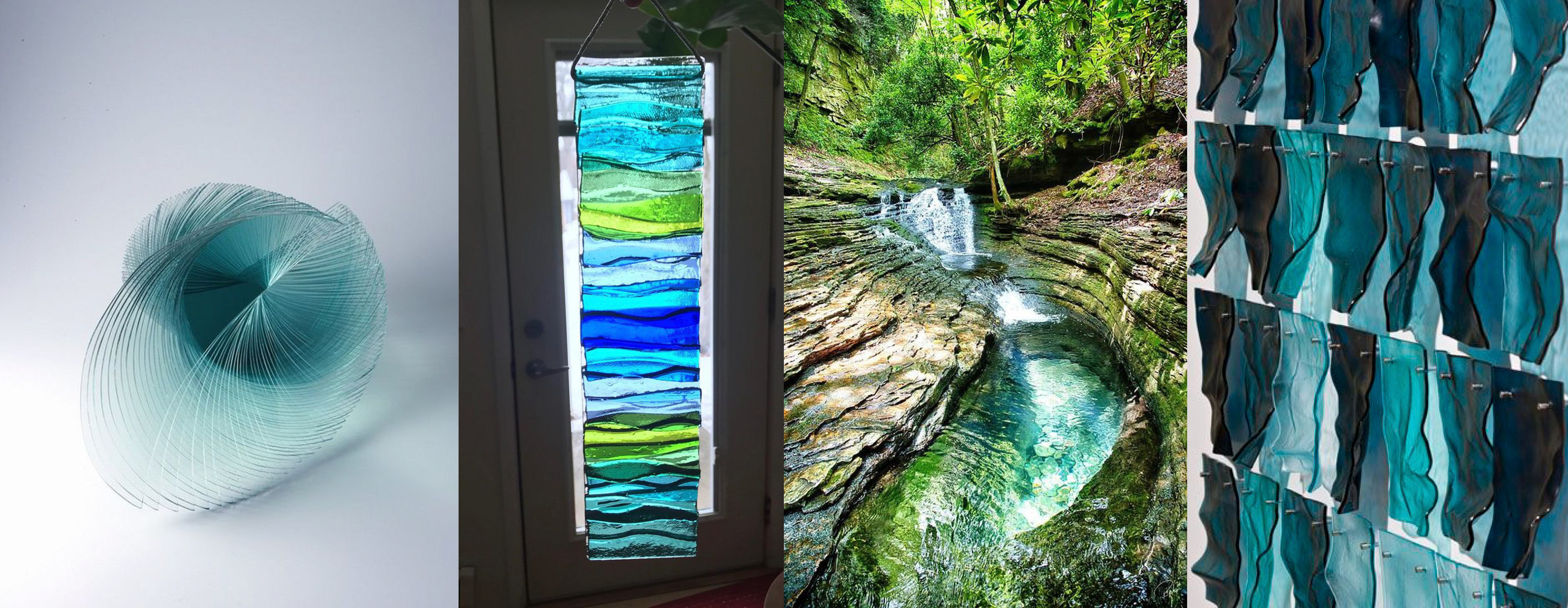
The guiding principles were to fit into the current design aesthetics of the architecture, design must take into consideration cancer patients as audience, must feel like a piece of art with a sculptural approach, create long-lasting engagement with community.
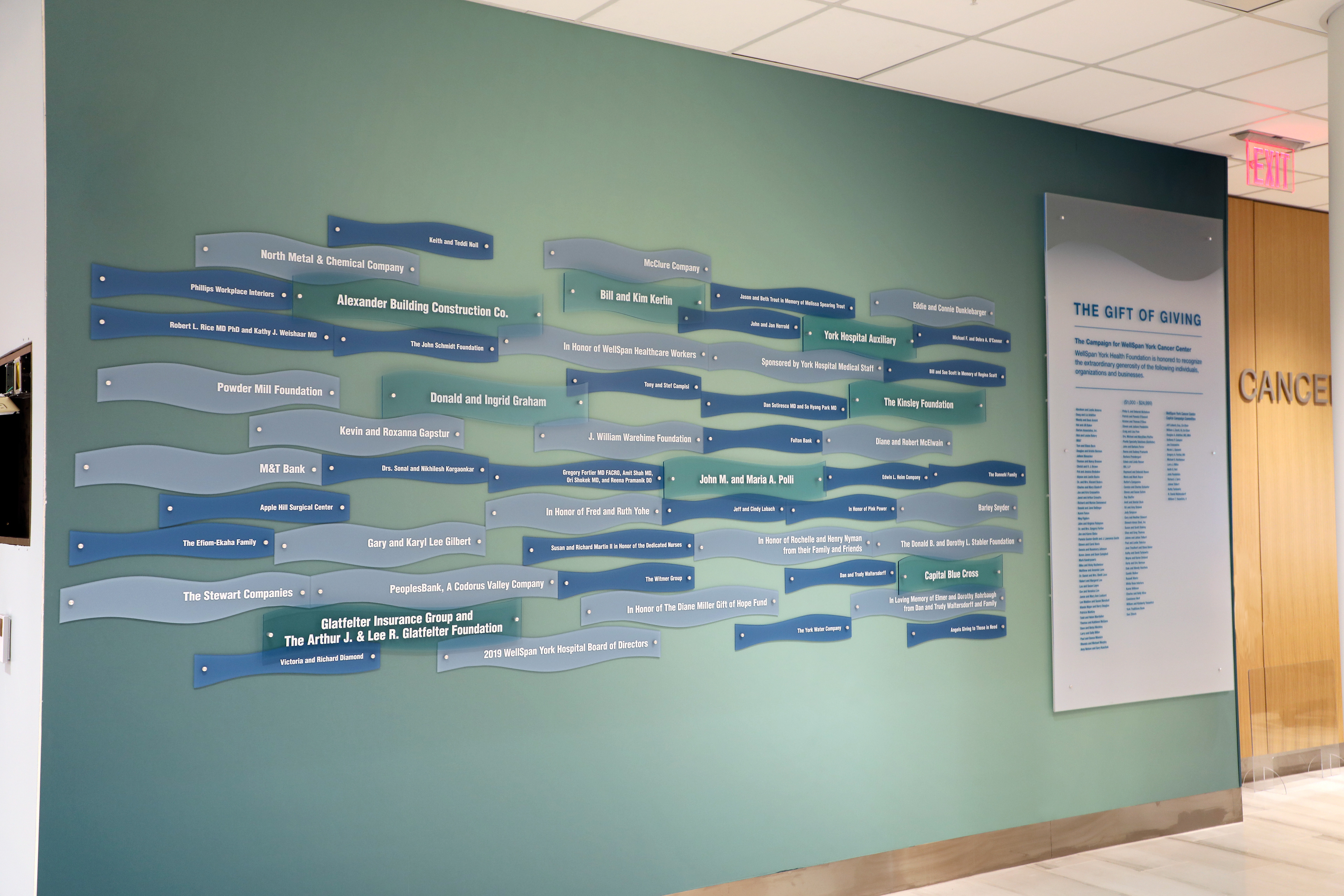
We found that the subtle waves of the ocean worked well with the wall graphics which simulated the flow of a stream. Similar to an ocean or sea, the bottom of the wall is darker as you move away from the light which is near the top or at the surface.
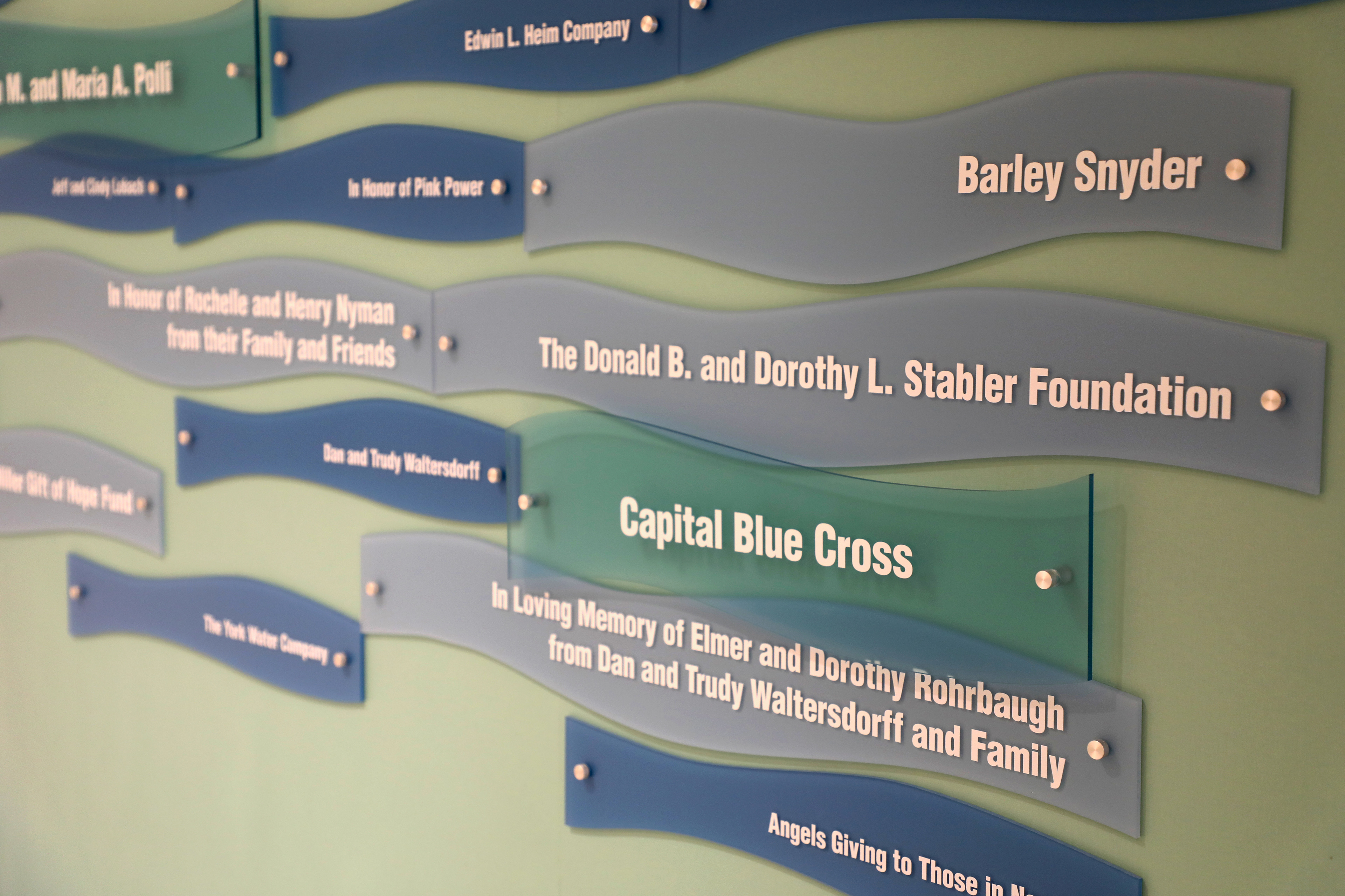
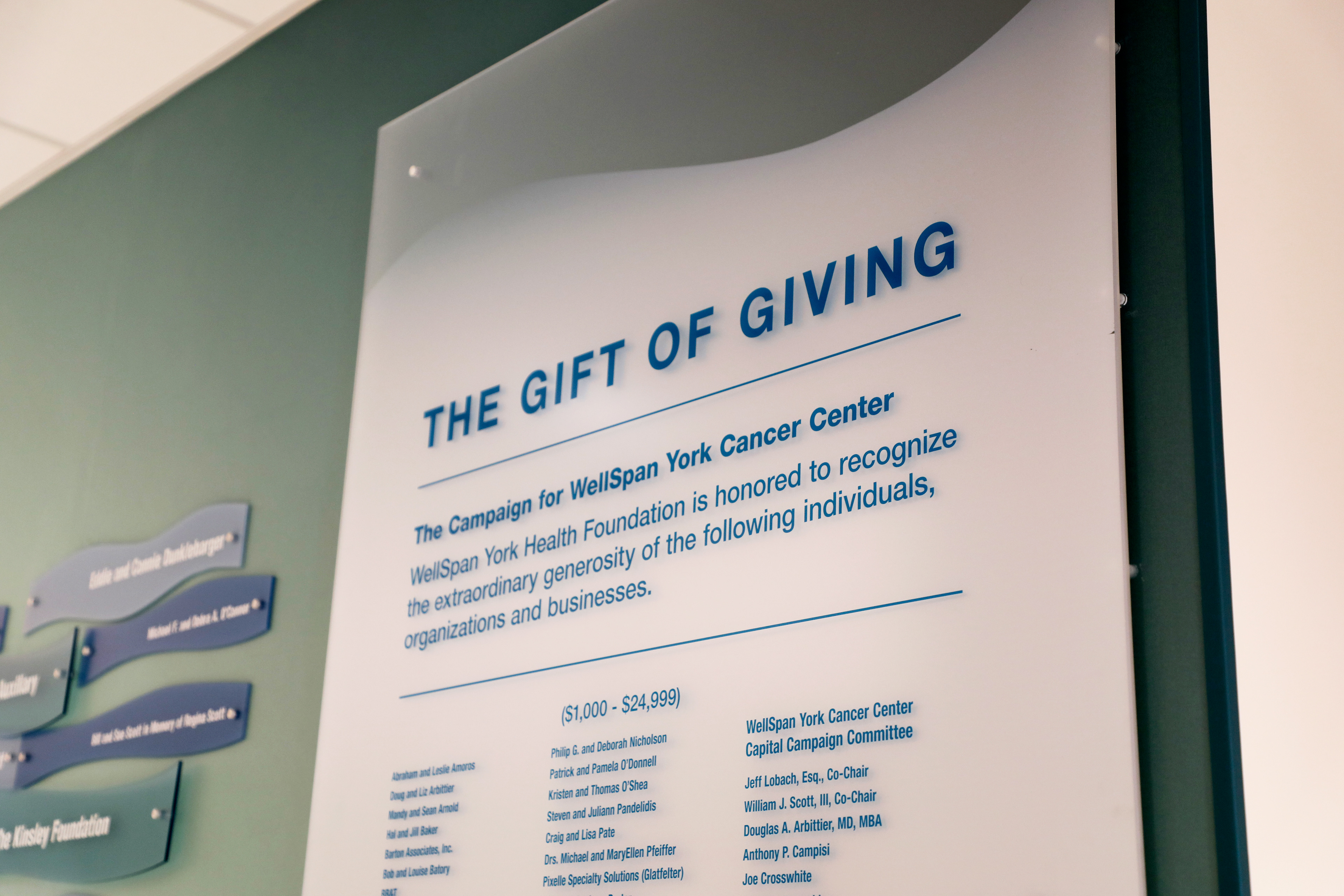

Each level of the Cancer Center had a color assigned so that patients could differentiate between floors.