

and electricity for 140 years.
Our goal was to strike a balance between historical nature (where they’ve been) and the future of a growing company (where they’re headed) while ensuring all facets are considered and feel a part of the whole.
Company: Graphcom
Role: Creative Director
Strategic Support: Amy Stem
Design Support: Ellen Wetzel
Signage Support: Justin Cook
Strategy / Graphic Design / Production
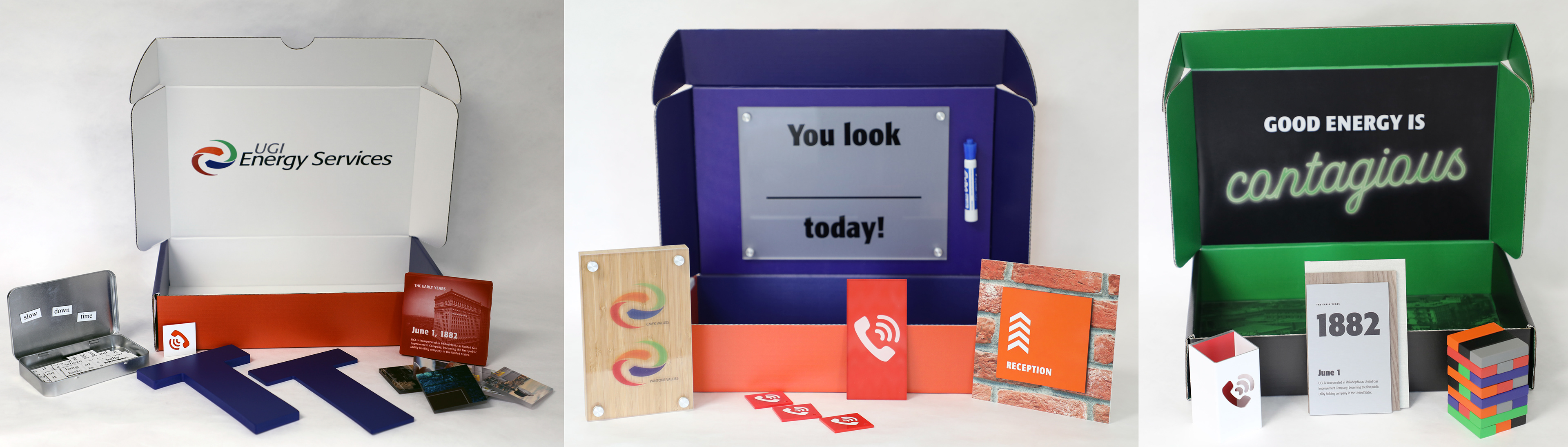
We presented 3 distinct personalities through a “magic show” revealing 3 unique boxes that allowed the client to touch and feel in order to evoke what the user experience would be like in their new building.
We called our philosophy "purposeful placement" and we aimed to bring inspiration and innovation to
every person in the organization by inviting them to experience culture firsthand and interact with the space.

Our theme utilized keywords (seen above) to verbalize 3 overarching principles: Simplify and Go, Personalized Service, and UGI's need to be Positioned to Meet Ever-Changing Demands.

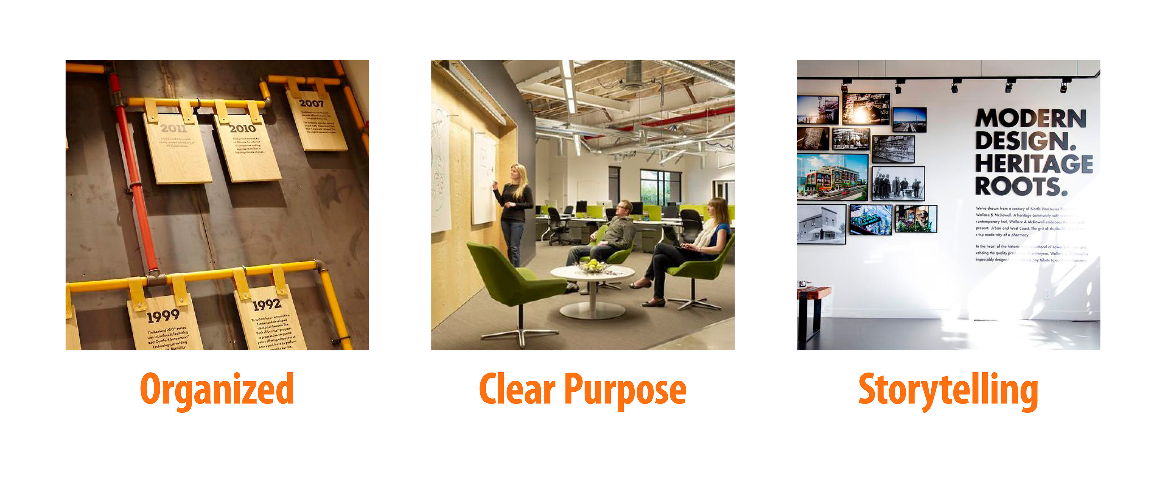
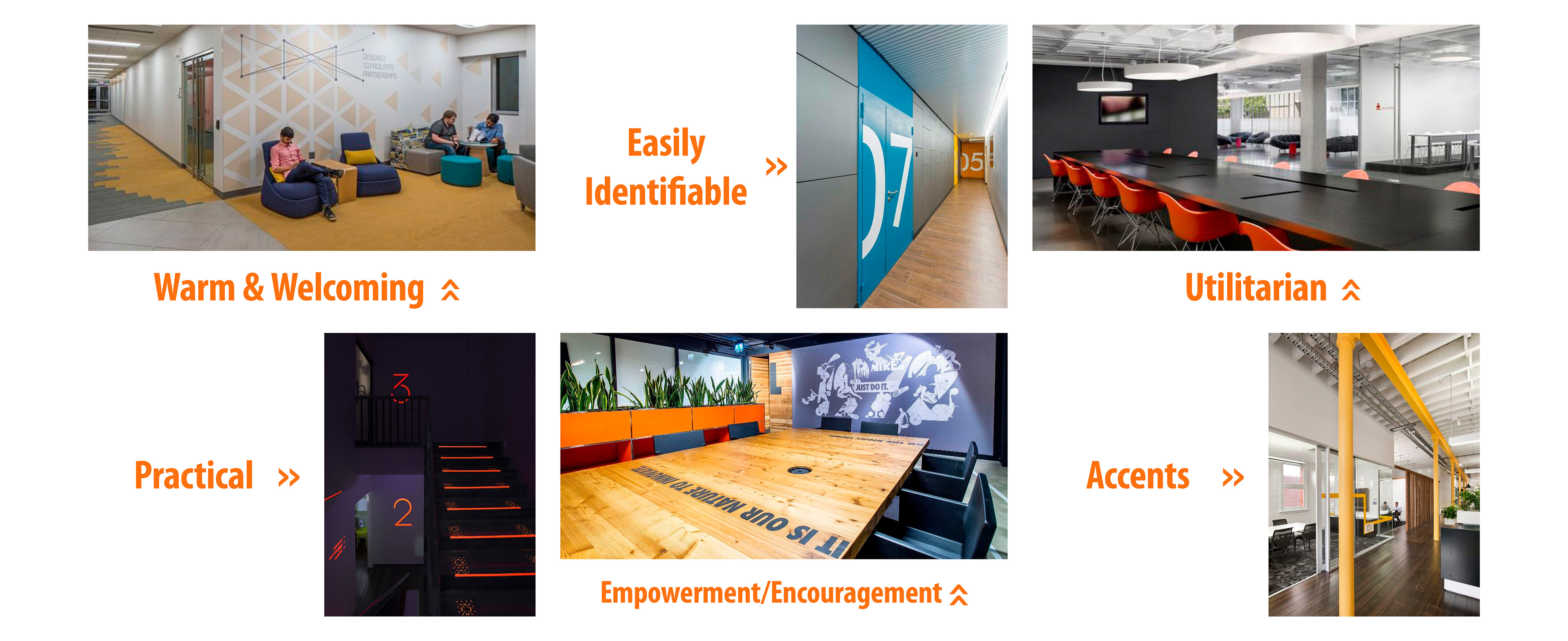
Signage and elements are purposefully placed within the space, focusing on functionality and usability. Along with the overall utilitarian nature, the space is encouraging, welcoming people in. Every thing has a place. Every thing is in its place. These are examples of the type of signage seen throughout the building.