WLR Insurance Solutions is not your average, run-of-the-mill insurance company. Through personalized commercial insurance protection, they offer an unprecedented concierge-level service to business partners in and around Maryland. If you value honesty, integrity, community and passion as much as they do, WLR Insurance Solutions is the perfect fit for your commercial insurance needs. They work tirelessly to ensure the protection and longevity of your business.
When it comes to insurance logos, simplicity is critical. All of the top-performing insurance agency logos are easy to remember and convey a message of trust and reliability. Colors such as blue and red often represent strength, courage, and security. Fonts are usually kept clean and easy to read. An effective insurance logo should be memorable and convey a message of strength and security.
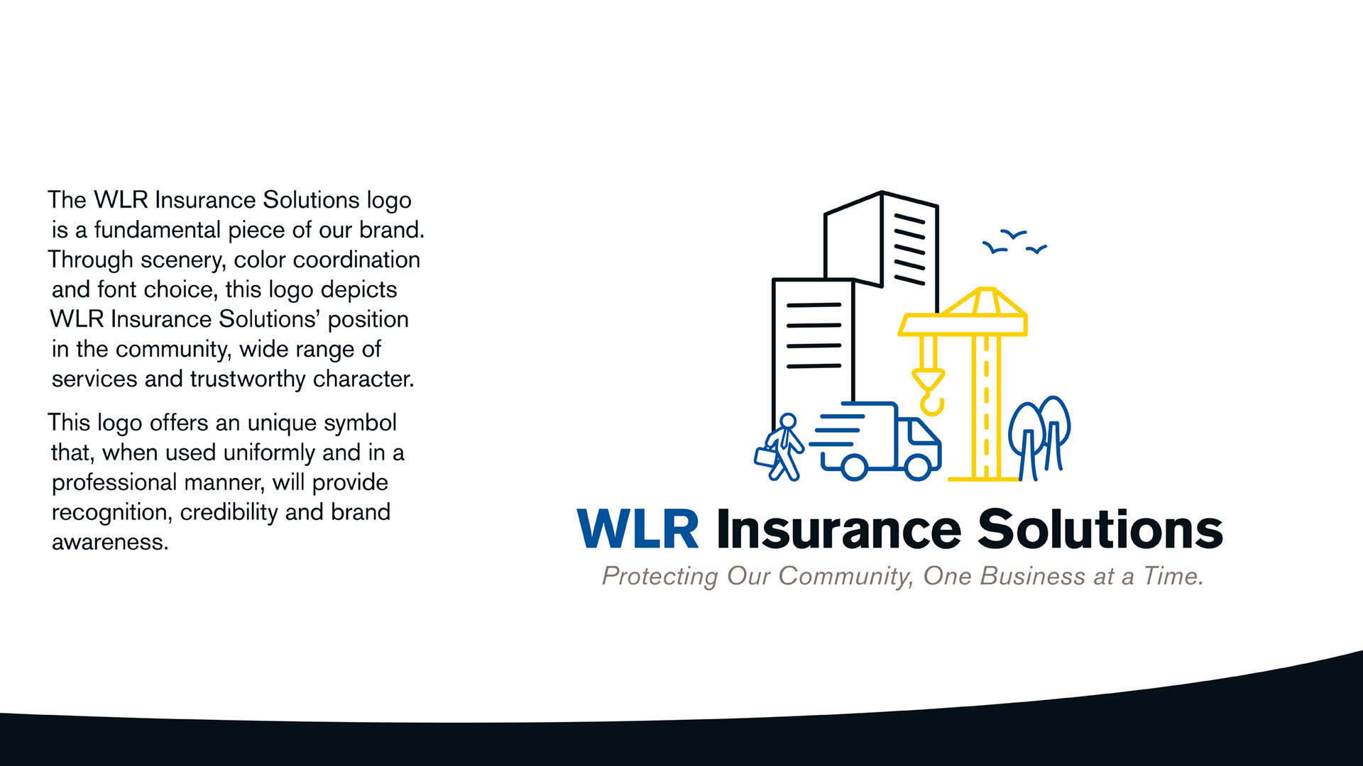
The goal was to create a professional logo that fits the Frederick, MD aesthetic. Take the house of brands approach, unifying all logo marks.
Company: Graphcom
Role: Creative Director
Account Manager: Shannon Waybright
Development: Brent Hackman
Copy: Jess Heydlauf
Design Support: Julia Richter and Lauren Beckjord
Strategy / Brand Development / Logo Creation / Website Development
Role: Creative Director
Account Manager: Shannon Waybright
Development: Brent Hackman
Copy: Jess Heydlauf
Design Support: Julia Richter and Lauren Beckjord
Strategy / Brand Development / Logo Creation / Website Development
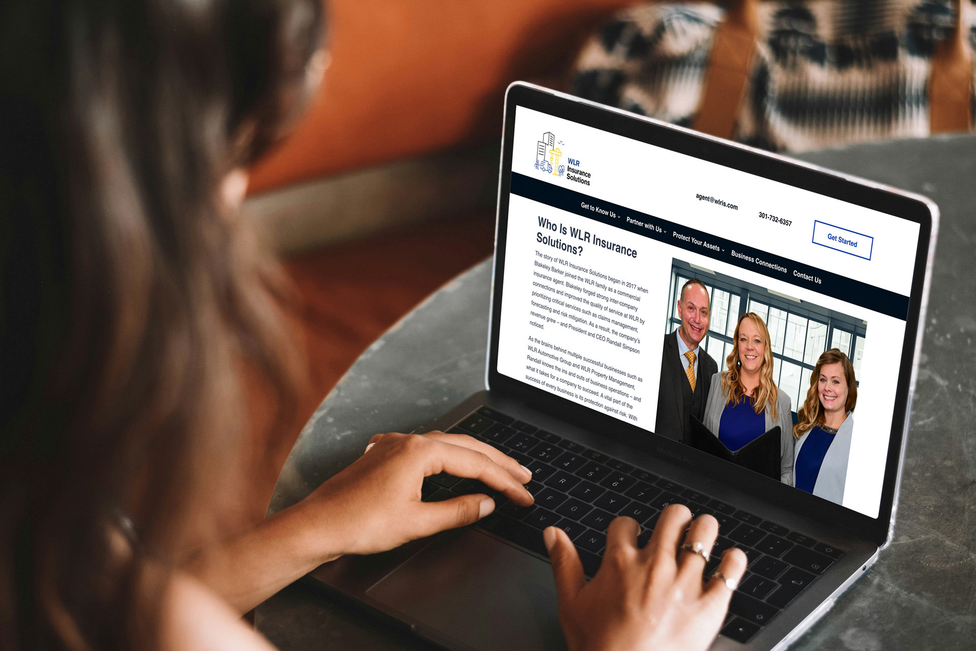
Check out their fully designed website here.
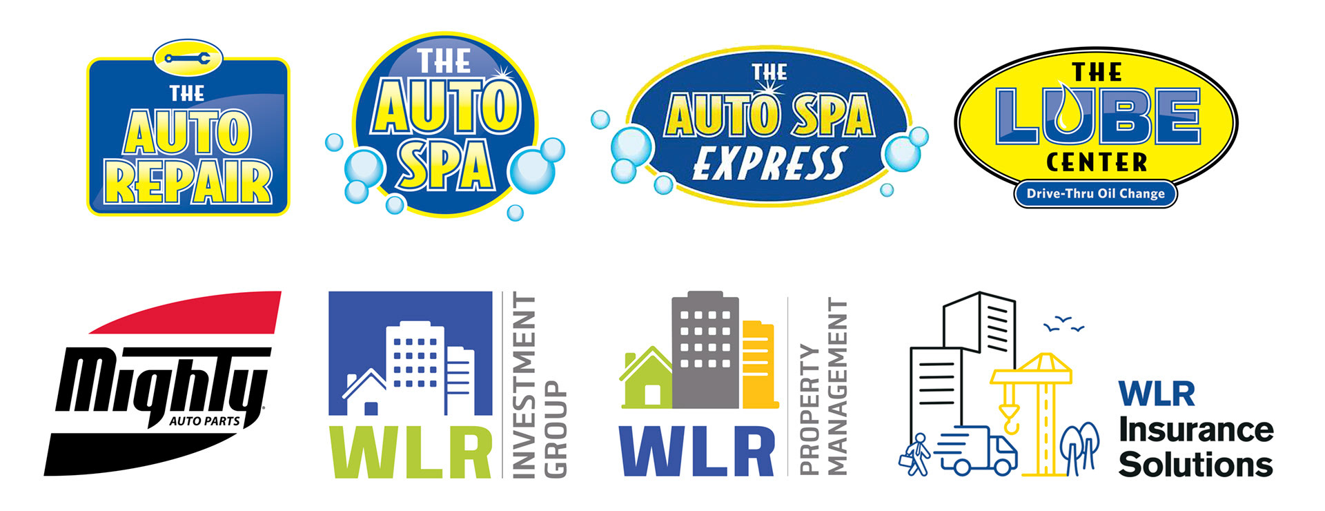
The goal was to create a professional logo that fits within the WLR Automotive Group brand family.

Insurance company logos are some of the most iconic and recognizable logos. A logo should be simple enough that even a child can draw it. This is because people need to remember the company’s name and logo in order for it to be effective. Here are several of the customized concepts presented.
The final logo chosen used symbolism to focus on businesses and employees while also being easy to embroider per the client's requests.